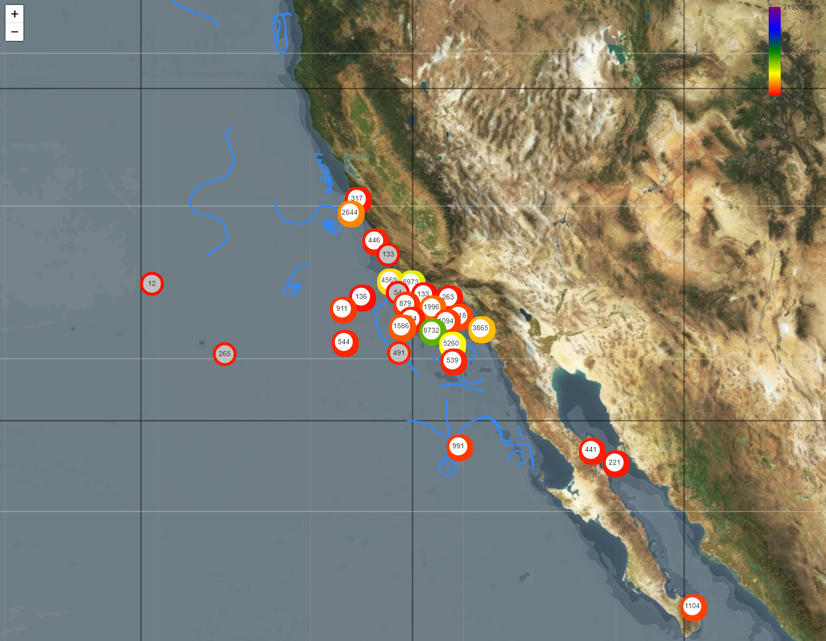
Tethys Data Explorer Tutorial
The Tethys Data Explorer is an interactive tool for browsing data stored in a Tethys database. It is designed to be a low-barrier entry to exploring Tethys and lets one take a quick look where and when instruments have been deployed, what type of passive acoustic monitoring efforts have been conducted, and what has been found. It is not as powerful as other Tethys client tools that permit the specification of detailed criteria (e.g., only data without a duty cycle, only data that have calibration records, etc.), but provides a good first look into the data stored within a server.
Starting the Data Explorer
- Navigate to the DataExplorer folder within your directory of Tethys files.
- Locate the batch file named data_explorer.bat.
- If your Tethys server is executing on a different machine than the one where data explorer is started, you will need to modify the batch file:
- Right-click on data_explorer.bat and select edit.
- Update the --server argument to point to your server. Modify “--server argument http://localhost:9779” to point to your machine, e.g. http://my.server.gov:9779 . If your Tethys administrator selected a different port or chose to run with secure socket protocol, you may need to change 9779 to a different value or use https:// instead of http://.
- Double click on the batch file to start the explorer.
Your administrator may have configured your machine so that you cannot start batch files by double clicking. If that is the case, open up a command window, navigate to the folder, and type data_explorer.bat.
Once started, data explorer will make a few queries to the server and then display a message similar to this one:
* Running on http://127.0.0.1:8050/ (Press CTRL+C to quit)Copy and paste the URL (http/https) address into your web browser.
Overview
The data explorer has a tabbed interface and by default starts on the detection effort tab (Figure 1).
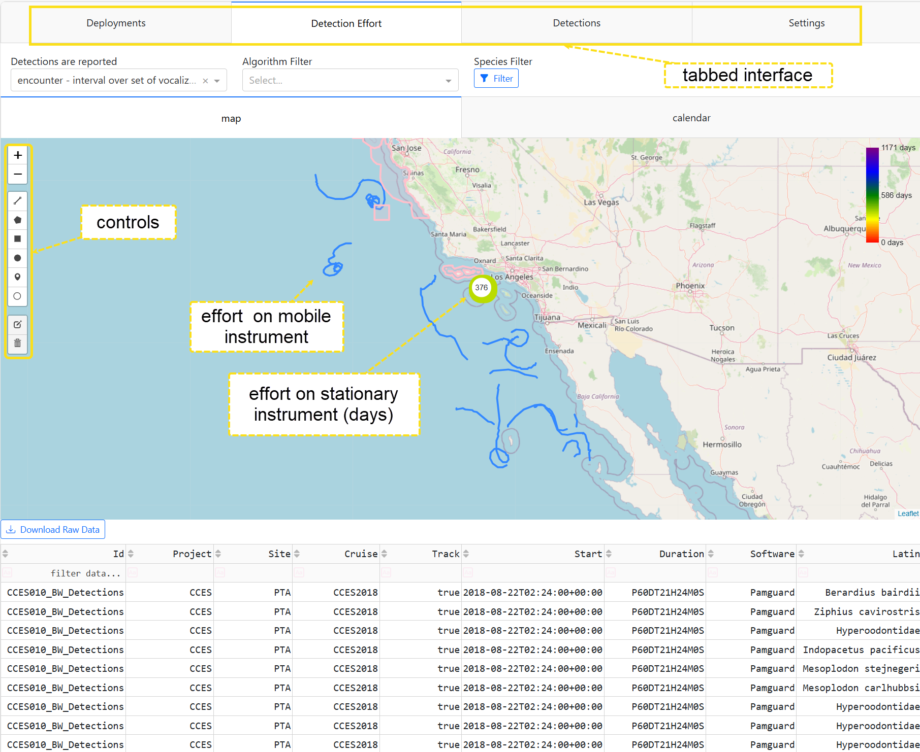
Each tab is for a different kind of task:
- Deployments - Show where instruments have been deployed. Mobile instruments with track data show their path.
- Detection Effort - Displays where systematic effort to detect species and calls has been undertaken.
- Detections - Shows detections associated with a selection made in the detection effort tab.
- Settings - General user settings such as how taxa are displayed (Latin or common names in another language)
On most tabs, a data table underneath the plot shows details about the data associated with the plot.
Deployments
Start by clicking on the deployments tab.
Map
You can zoom in and out on the resulting map (Figure 2). Zooming is accomplished by either using the +/- icons on the map or using a zoom action (middle mouse wheel, two-finger spread/pinch on trackpad or touch screen). To pan, click and hold the mouse and move while holding, or tap and move your finger on a touch pad, or simply touch the screen and move your finger. Zoom out now until you can see all of the deployments.
Circles on the map represent stationary deployments and the number within the circle indicates the number of days of recording effort. Circle color is indicative of the following:
- Circle fill color
- Gray represents a single deployment.
- White indicates multiple deployments that have been clustered together as they are too numerous to display.
- Circle color
- The color of the circle is related to the number of days of recording, a color bar in the top right shows the scale.
As you zoom in and out, you will notice that the circles change numbers and color as the cluster composition changes.
Mobile deployments are represented by tracklines. Hovering over a single (gray) deployment or trackline will show the deployment identifier and the start date of the recording. Clustered deployments do not exhibit this behavior, but the number in the circle represents the total number of days of recording in all deployments represented by the circle.
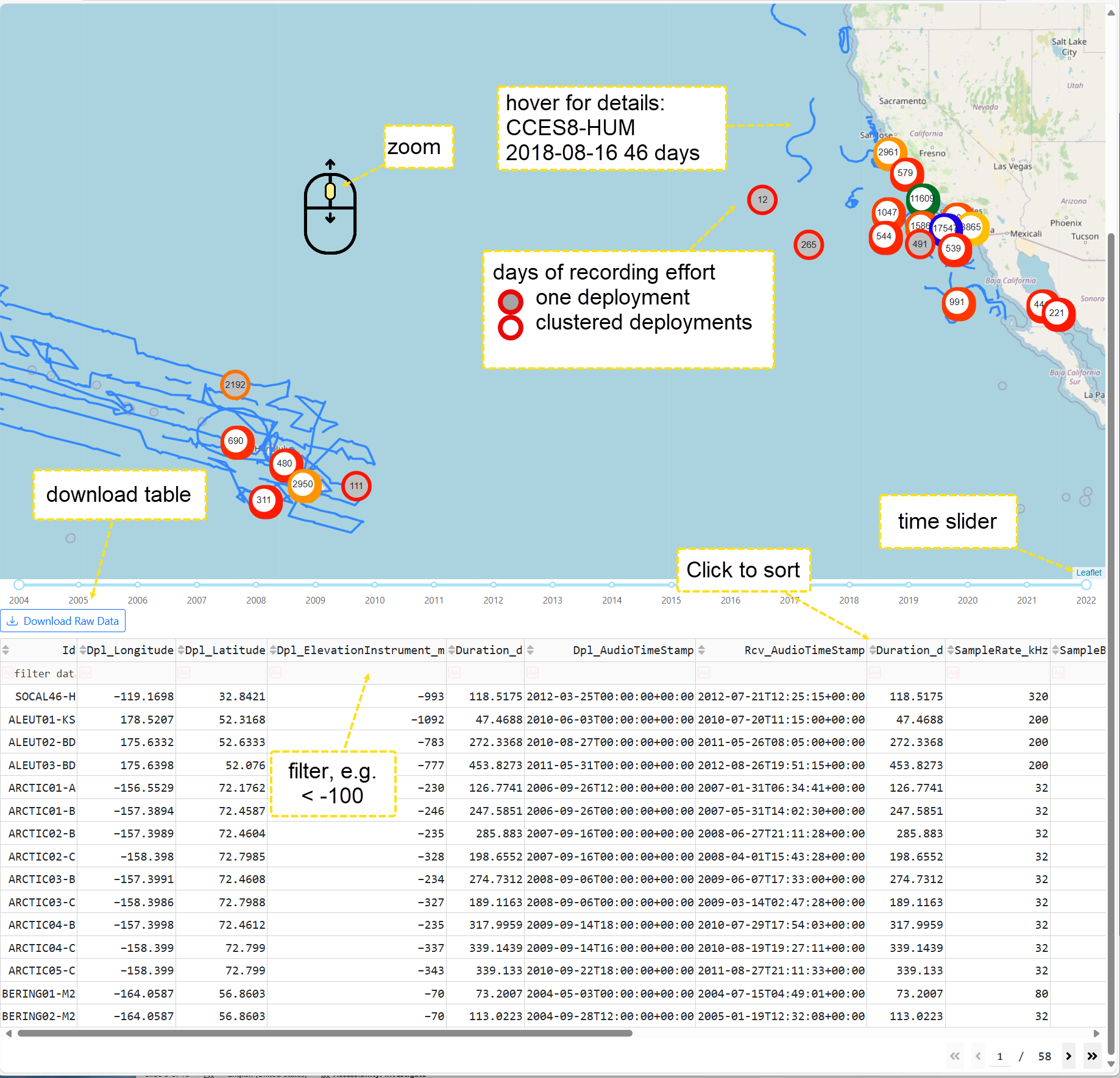
A time slider has two knobs that permit filtering of deployments by year. Try it now and watch the map view change.
Data table
Underneath the time slider is a data table. It lists a subset of the data associated with each deployment such as deployment elevation (negative numbers indicate depth in m), sample rate, number of channels, etc. Scroll down so that you can see the entire table. The table is paged, and < and > buttons allow you to move between pages. Next to each column heading, there are up and down arrows (⇳). Clicking up sorts the rows in ascending order for the data in that column, and unsurprisingly, down sorts in descending order.
Beneath each column header is a blank row for filtering data. Entering a value in that row restricts the table to rows that contain the text or equal a number. Try typing SOCAL in Project and M in Site). You can also use relational operators (=, <, <=, >, and >=) to filter values. Clear out any filters that you may have created by clicking in the column and using backspace. Then try typing > 1 in the ChannelCount column. You should see the multichannel deployments.
The  button will download the enitre table (data filters are not considered) as either an Excel or comma separted value (CSV) document, depending on the current settings.
Filtering the table does not currently update the map. This may be changed in future releases.
Detection Effort
The detection effort tab shows where and when effort to analyze acoustic data from the deployments has been made. Like the deployments tab, a map view shows both mobile and stationary effort. Colored circles represent the number of days that have been analyzed.
It is common to have separate analysis streams for the same data. This occurs when multiple analysts or algorithms process the same data set. This can result in more days of analysis effort than recording effort. In addition, two different analysts or algorithms could be looking for the same species or call, resulting in a duplication of effort. This can create problems for any analysis task that relies on counts of detections. For example, a cue-rate based density estimate would double if the same calls were detected twice and not recognized as being the same set of calls. This can frequently be avoided by filtering such that only one set is detected. The Data Explorer does not attempt to resolve these, and one should be careful about misinterpreting results containing duplicate effort.
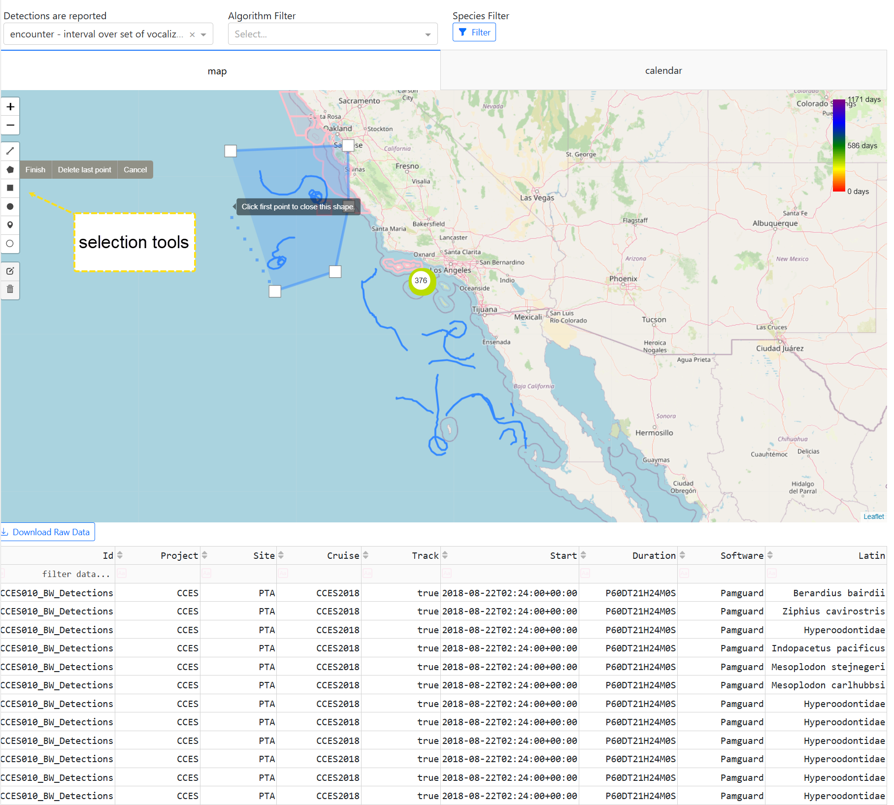
Detection effort (Figure 3) has subtabs for spatial and temporal selection of effort. Both of these permit the selection of effort to see what was found. Beneath these tabs a data table shows the effort that is available for selection.
Map view
The map view behaves similarly to the deployments tab, with the exception of an additional tools panel on the left side. Three of the tools are relevant to selecting effort:
- polygon - The pentagon symbol allows one to draw arbitrary polygonal regions, as in the figure above. Clicking on the map add vertices to the polygon, click on the first vertex to complete the polygon.
- rectangle - When selected, drag out a rectangular shape to select effort.
- circle - Select, then click to set the center of a circle. Drag and release once the circle is of the appropriate size.
When selecting detection effort associated with mobile deployments, be sure to select the entire track or it may not be included. Once a selection has been made, you will be automatically switched to the Detections tab.
Calendar view
The calendar view (Figure 4) shows effort by time, species, and, call (when call is part of the effort specification).

The calendar view has a set of tools in the upper-right corner that become visible when your mouse pointer is inside the plot:
 Download plot will take a snapshot of the calendar as currently displayed and download it as an SVG file (or PNG file if you’ve changed the default settings).
 Zoom, the default action if nothing is selected, allows the user to draw a box on the calendar and zoom in on the selected section of the plot.
 Pan allows the user to move around the calendar by clicking and dragging the cursor.
 Box Select allows the user to draw a box around a section of the calendar. Note that if you draw a box around a species/call for which there are detections, the view will switch to the Detections tab where a weekly plot of the species/call selected will be displayed.
 Lasso Select allows for a free-form selection, permitting the selection of non-rectangular regions.
 Zoom in and
  Zoom out will adjust the zoom level on the calendar.
 Autoscale and
  Reset axes will return the calendar to the default view.
To select effort, move your cursor to the top right of the plot and click on either the box or lasso selection tool. With one of these selected, you may drag out a rectangle or free-form shape around the effort bars to see the detections associated with the effort.
Filters
Filters allow one to restrict detection effort based on several criteria.
Granularity
Granularity categorizes detection effort into one of four categories based on how detections are reported. This is the only filter that is always enabled as it rarely makes sense to mix detections from multiple granularities. The drop-down menu labeled “Detections are reported” allows selection of one of the following categories (only categories that have effort will be listed):
- binned - Presence or absence is reported every N minutes. The value of N is recorded in the Tethys database as @BinSize_min, but this is not selectable in the data explorer which strives for simplicity. Some entries in the demonstration database were from older efforts where the time of a call was reported rather than the Start and End of the presence/absence bin.
- encounter - The start and end times of a bout of calls. The minimum time required to separate between encounters can be stored in the database as @EncounterGap_min.
- grouped - A group of related calls such a click train or song.
- call - Individual calls are reported.
Changing the granularity will update the display to show effort associated with that granularity.
Algorithm
The algorithm pull-down menu lists algorithms that were used in the current set of detection effort. Multiple algorithms can be selected, and any algorithm can be removed by clicking on the \(\times\) button.
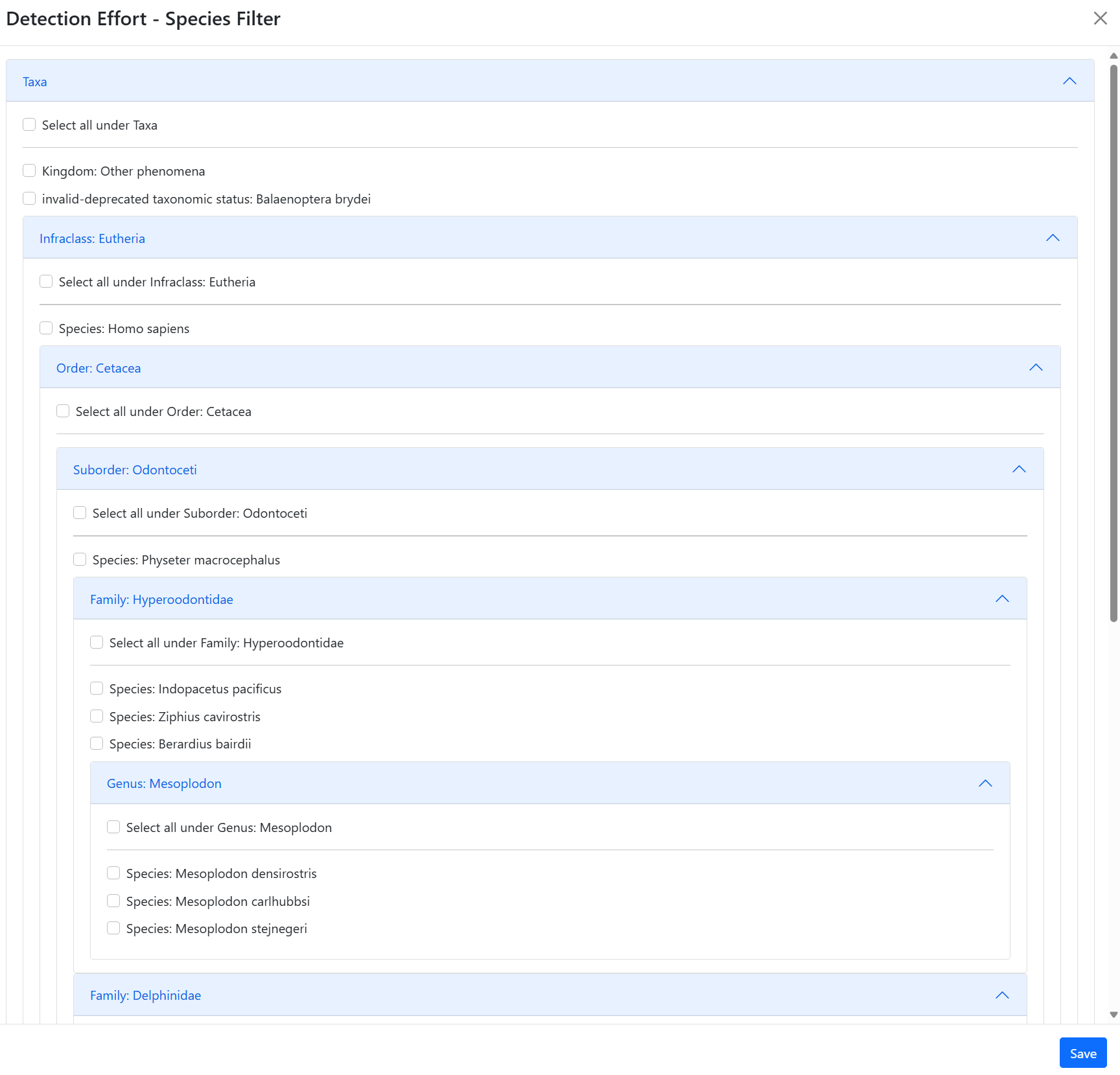
Species
By default, detection effort for all taxa is shown. Clicking on the species filter permits restricting effort to specific taxa. A list of species for which there is effort in the current data set is presented (Figure 5). Clicking on higher order taxa such as family Delphinidae (dolphins) will select all members of that taxa for which there is effort (e.g., killer whales, Pacific white-sided dolphins, etc.).
Detections
The Detections tab will show empty plots when the Data Explorer is first opened. Users must select species/call detection effort from the Detection Effort tab to generate plots in the detections tab. When the Detections tab is populated with data, there will be a figure on the top (either a weekly plot, diel plot, or a map of detections) and a data table on the bottom. Each plot type is presented as a separate tab under detections.
When plotting long time series, one needs to remember that computer displays have a finite resolution. If too much data are displayed for the resolution of the screen, artifacts such as rectangles that are too small to display may occur.
Hours of detections per week
The weekly plot (Figure 6) display provides the number of hours with detections per week for individual species. Note that these plots are for a given species and may represent multiple call types across multiple sites. The colored bars show the detections for each species while gray bars indicate weeks with analysis effort that does not span the entire week. These no-effort bars are plotted from the top down. If there is partial effort in a week, a bar depicting the maximal number of hours that could contain detections would end where the no-effort bar begins. If the detections span multiple periods of analysis, the no-effort bars may occur in the middle of the plot.
Hovering the cursor over a bar will display the species, the start date for the weekly bin, and the number of hours with detections that week. The plot has the same control tools that we saw on the calendar view.
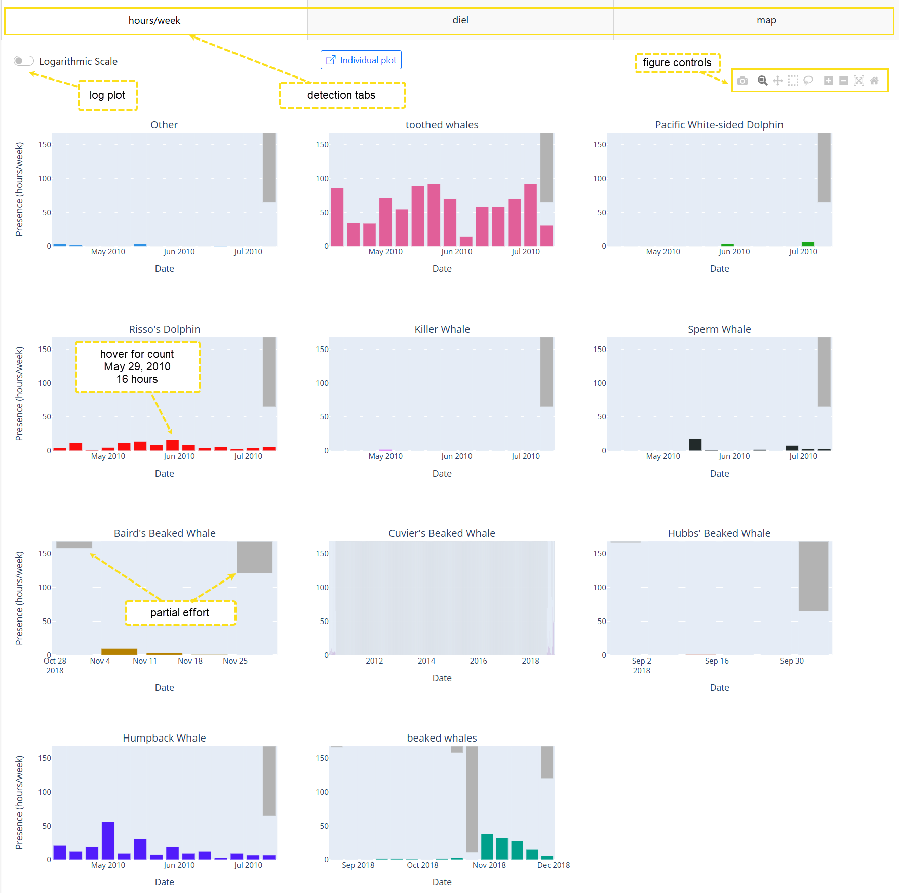
Notice how some of the weeks with low counts are difficult to see. The Logarithmic Scale button will toggle counts between linear and logarithmic scaling, making it easier to see these.
The  button will display a single plot at a time (Figure 7). This is useful when there are many plots and you wish to examine details or save a single plot. Click on the button to open the individual plot display.
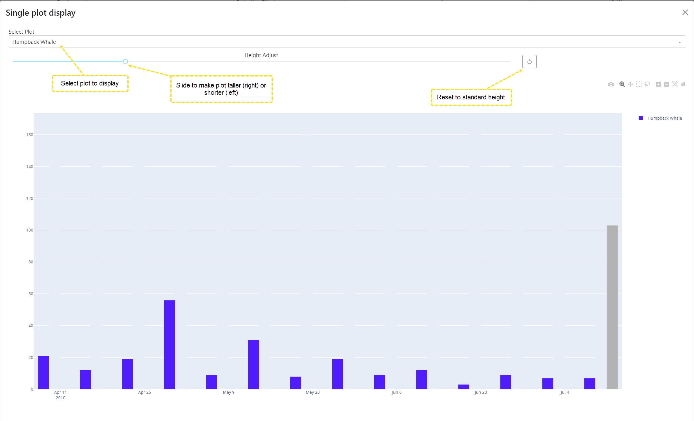
The main components of the display are a drop-down menu to select the plot to be displayed, a slider that can adjust the height of the plot, and a reset button which restores the plot height to fit in the window. In addition, the tools explained in the calendar view section are available to save the plot or zoom in on sections of it. Setting a taller height can help to overcome artifacts when there is insufficient screen resolution to faithfully draw the plot.
Diel
The diel tab displays detections in a manner that makes daily and seasonal patterns more apparent (Figure 8). The x-axis denotes the hour of the day. This defaults to hours relative to midnight UTC, can be adjusted to local time. The y-axis denotes the day. Gray regions show times without analysis effort.
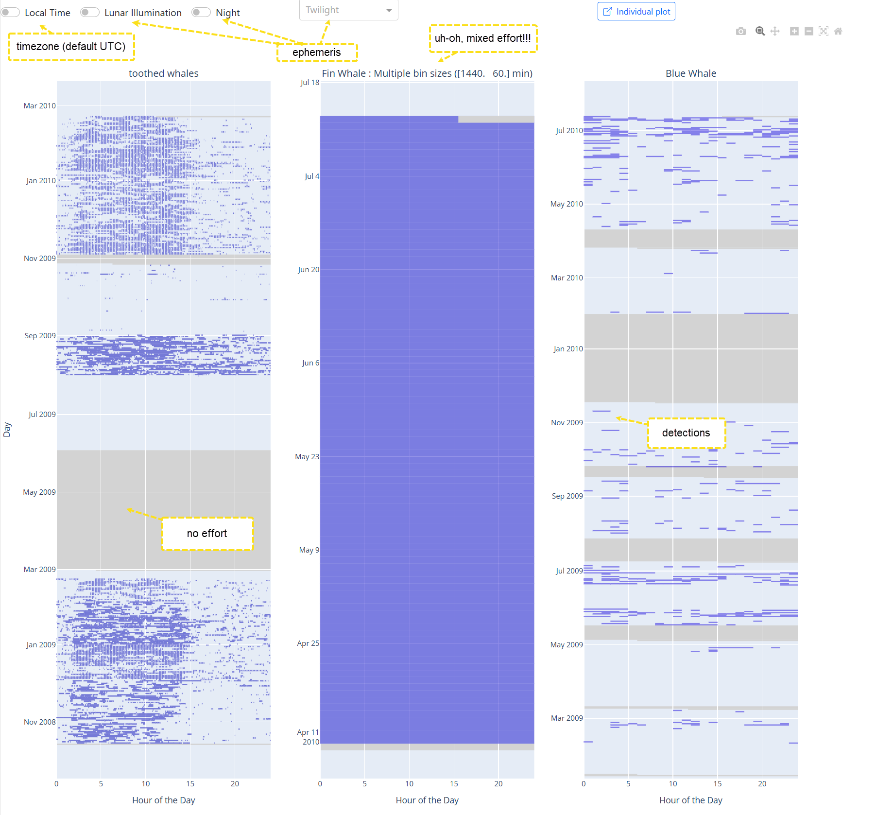
The above plot shows binned detections for three taxa: toothed whales, fin whales and blue whales. The plots all look very different due to differing bin sizes (the aforementioned @BinSize_min). The fin whale plot has a warning that multiple bin sizes are being used, this is a case of multiple effort. In this plot, the bin sizes are 1440 and 60 min (1 day and 1 h respectively).
Recreate this plot by querying the demonstration database for binned effort around Southern California. Then restrict the data table to look for fin whales, Balaenoptera physalus if you are using Latin names. You will see that two different analysis methods have been used, one with daily detections and the other hourly. Fin whales were detected each day, resulting in the the solid block of blue.
At the top of the display, the standard toolbar that was explained in calendar view is present, as well as the  button that we saw in the hours of detections per week plot.
The remaining controls are:
- Local time (toggle) - By default, everything is displayed in UTC time. Clicking on this button will shift to a local time based on nautical time zones. We do not consider geopolitical boundaries.
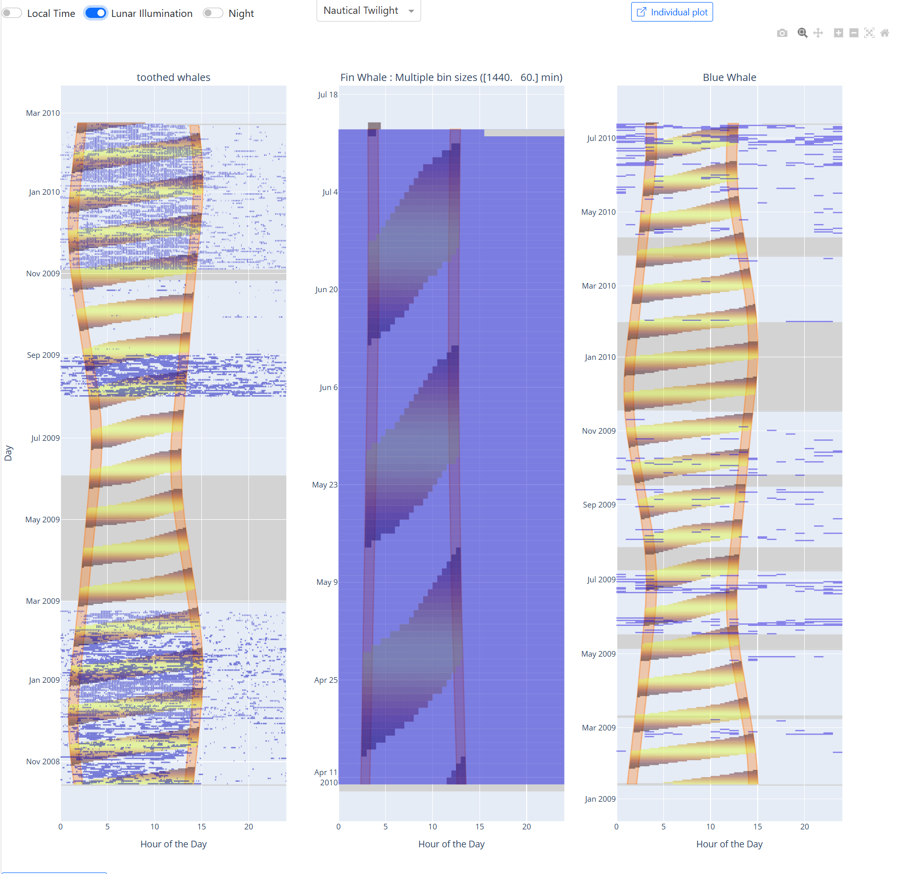
- Lunar illumination (toggle) - When enabled, shading is added to display the percentage of the moon that is illuminated during nighttime periods.
- Night overly (toggle) - Adds shading to indicate the difference between day and night.
- Twilight (drop-down menu) - Add shading to show twilight periods to better identify crepuscular activity. Three twilight types are provided:
- Civil – Sun is 0.56 º to 6º below the horizon. (0.56º accounts for the curvature of the earth and refraction).
- Nautical – Sun is 0.56 º to 12º below the horizon.
- Astronomical - 0.56 º to 18º below the horizon.
When the detections are from multiple locations, the ephemeris (sun and moon positions) are computed from the mean latitude and longitude. The ephemeris will not be very accurate when plotting detections across large geographic regions. Figure 9 shows the same detections as in Figure with day/night and lunar overlays.
Map
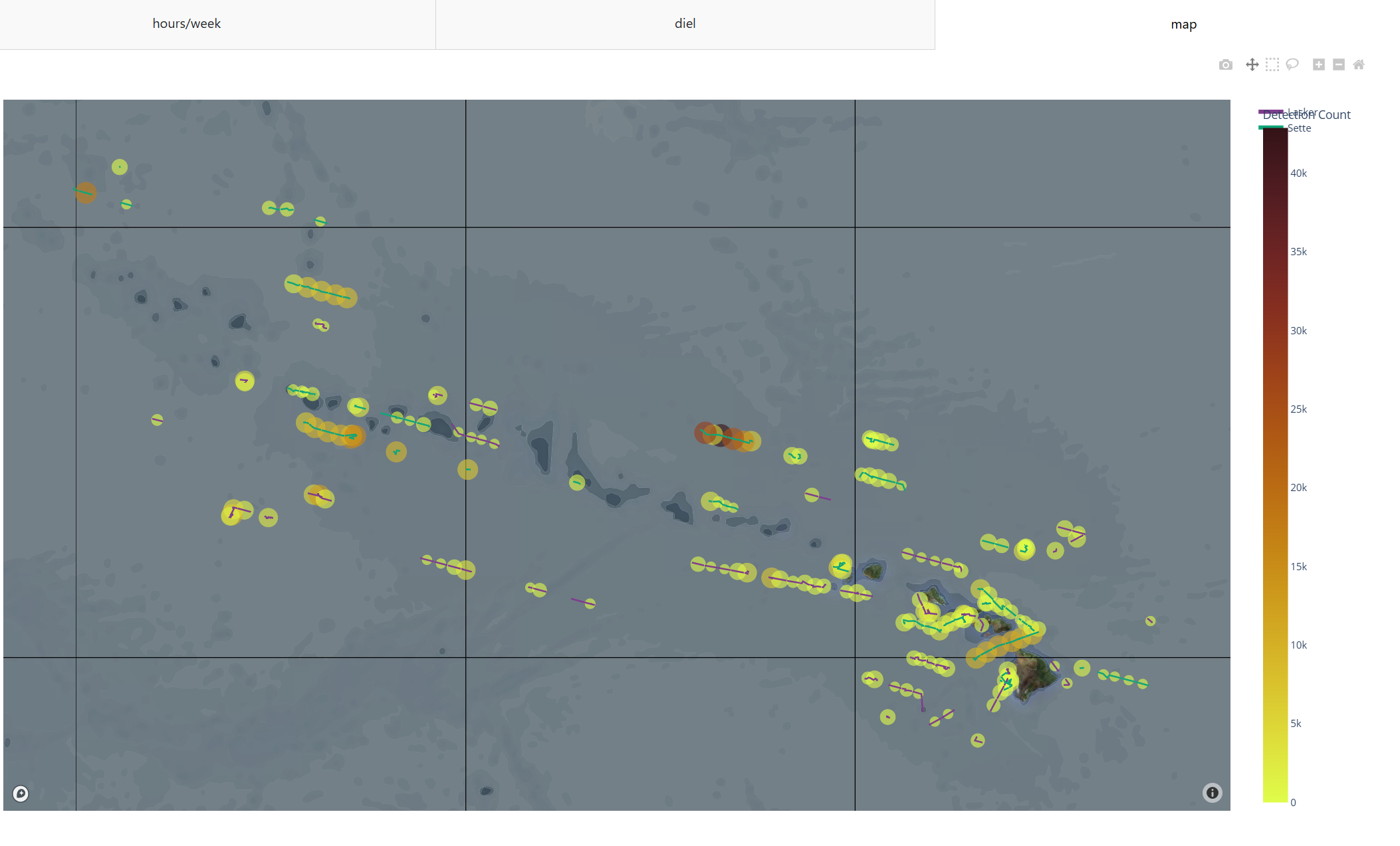
The map tab shows detections on a map (Figure 10). For detections from single deployments that are stationary, this is usually not very interesting. For mobile deployments, detections are plotted at one point on top of the track line. The figure below shows detection of individual whistles from two NOAA Hawaiian Pacific Islands cruises (data from the 2022 Detection, Classification, Localization, and Density Estimation conference).
Settings
The settings tab allows one to configure the behavior of Data Explorer. Most of these settings are persistent, indicating that once you set them, they will keep the same setting the next time Data Explorer is used.

The Image save format drop-down allows the user to select the file format that images will be saved in (e.g., when taking a snapshot of the Detection Effort calendar or Detection plots). The current options are scalable vector graphics (SVG; default) and portable network graphics (PNG). At present, changing the image format only affects saves after the data explorer is restarted (close the window, the program, and restart).
The Data table save options drop-down allows the user to select whether they want a summary (default) of detection information (i.e., a list of species, call types, dates and times of first and last detections, the total number of detections, and the detection method) or complete detection information (i.e., document and deployment IDs, start and end times, species, and call type for each detection).
The Datatable toggle allows the user to select whether they would like the data table saved as an Excel (default) or comma-separated values (CSV) file.
The Species Language drop-down allows the user to select the format they want species names displayed in while using the Data Explorer. The current options are Latin (default), English, Spanish, and French.
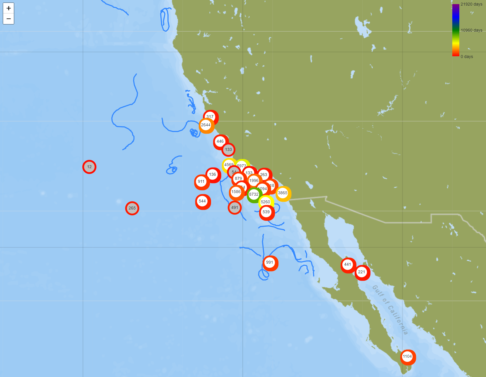
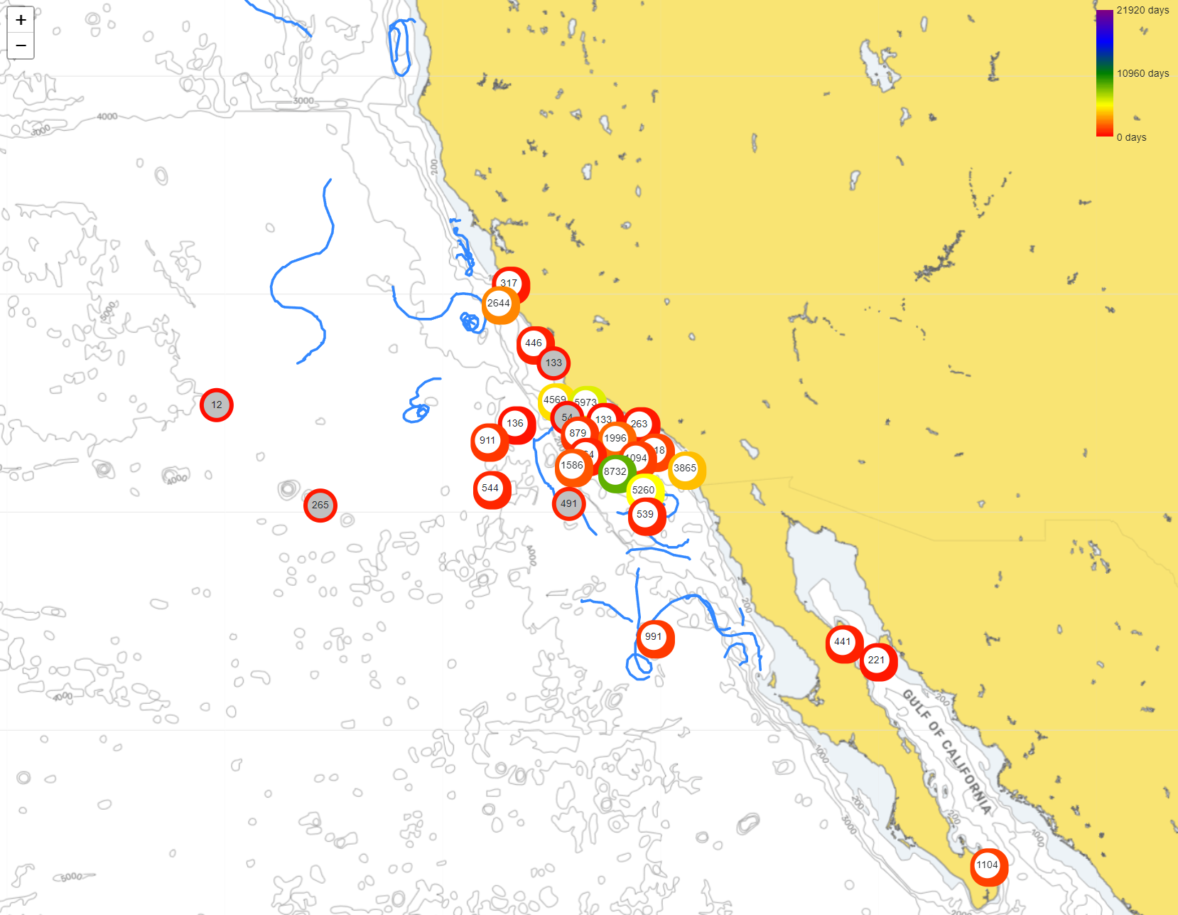
The map style drop-down allows the user to specify how maps should be rendered (Figure 11). Choices are presently: shaded bathymetry 1, shaded bathymetry 2, or nautical chart (isobar). In most cases, the maps will be rerendered using the new map style. The detections map uses a different mapping technology and will not be updated until a new set of detections are displayed.
